When choosing the color palette for the cabin, our goal is to create a soothing, calming atmosphere that helps our guests unwind and feel at ease.
As we embark on the renovation of Stewart’s Folly, we’ve put a lot of thought into every detail—especially the colors that will define the cabin’s interior. Color has the power to create a mood, set a tone, and transform a space into something truly special. We aim to craft a serene, relaxing environment where guests can unwind and recharge, so we’ve chosen a thoughtful color palette that blends nature-inspired hues with timeless neutrals. We’re excited to share these colors with you, our future guests, and give you a sneak peek into the soothing atmosphere we’re working to create.
Why Color Matters
When designing a vacation retreat, color is crucial in setting the mood. We wanted to create an interior that feels like a cozy embrace—a space where you can leave stress behind and truly disconnect. Each color we’ve chosen is intended to invoke a sense of calm, tranquility, and comfort, drawing inspiration from the cabin’s natural beauty.
From soft blues that reflect the sky and water, to warm yellows that capture the sun’s golden hues, we’ve carefully selected shades that bring peace and relaxation into every room. We also considered the importance of using timeless, neutral tones to balance the more vibrant hues. The result is a calming, cohesive palette that will enhance the experience for every guest who steps through the door.
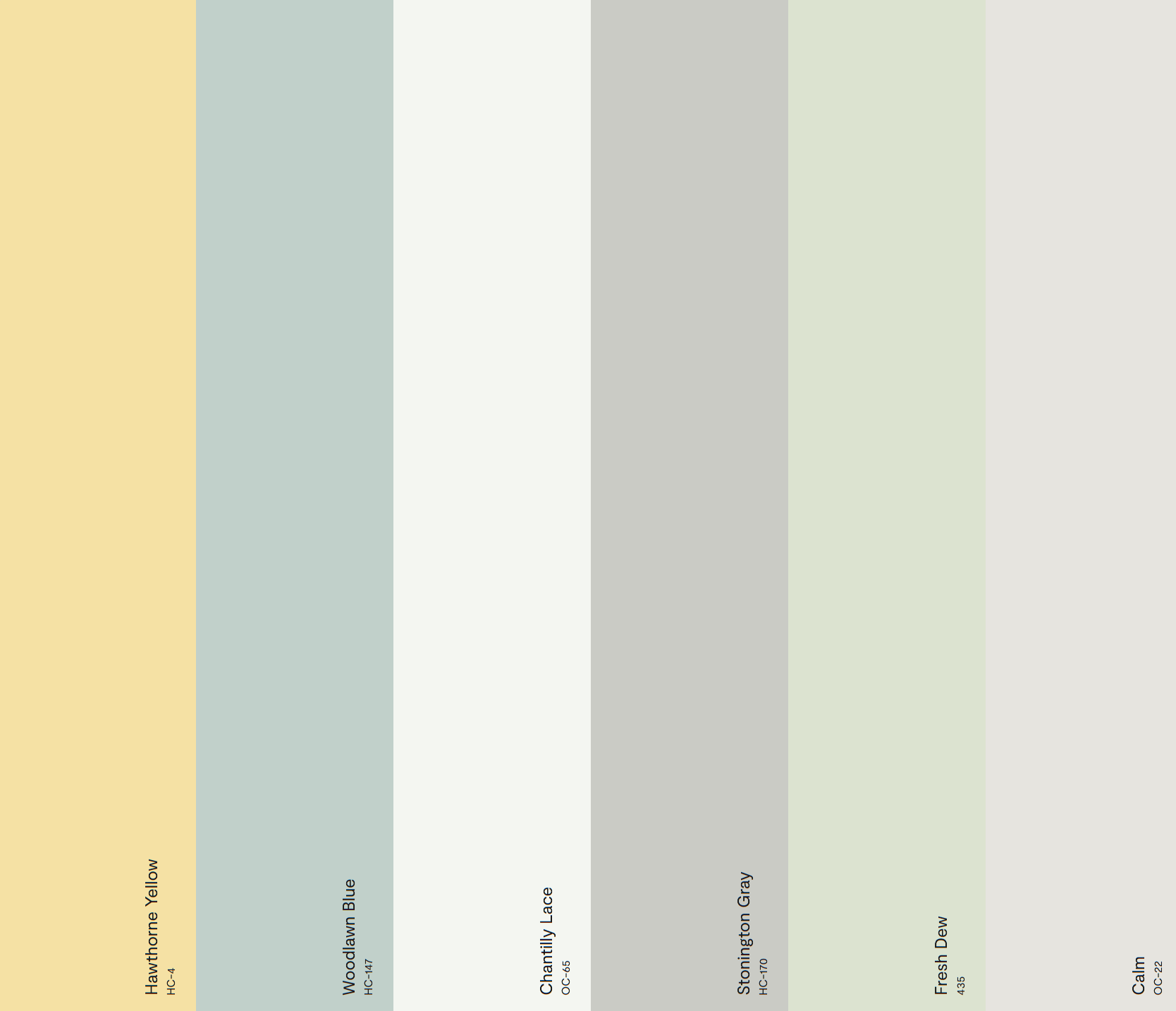
Our Color Selections
After much thought and deliberation, we’ve selected the following Benjamin Moore colors to bring Stewart’s Folly to life. With their varied tones and complementary hues, these shades will create the perfect backdrop for your getaway.
- Woodlawn Blue HC-147
- This soft, muted blue brings to mind the sky and the calming essence of nature. It’s a color that evokes peace and serenity, making it perfect for the living room or bedrooms. It’s inspired by the quiet blues of the Poconos’ lakes and skies, a gentle reminder of the surrounding beauty outside the cabin’s walls. Woodlawn Blue will set the tone for relaxation and comfort, welcoming you to unwind in a soothing space.
- Calm OC-22
- As the name suggests, calm is all about tranquility. This light, an almost ethereal shade of green, creates an atmosphere of peacefulness and contentment. It pairs perfectly with Woodlawn Blue and adds a soft, natural touch to any room. We envision this color in spaces like the kitchen and bathrooms, where it can help create a refreshing, restorative vibe.
- Hawthorne Yellow HC-4
- A warm, inviting yellow, Hawthorne Yellow adds a touch of sunshine to the cabin without being overwhelming. It’s the perfect accent color to evoke warmth and happiness, reminiscent of golden sunsets and crisp, fall mornings. We’ll use this color in key areas like accent walls or a cozy reading nook to bring cheerful and uplifting energy into the space.
- Chantilly Lace OC-65
- Chantilly Lace is a clean, crisp white that will help brighten the cabin and add a touch of elegance. This color will be used for trim, ceilings, and in places where we want to maintain a light, airy feel. Its subtle warmth complements the softer tones of the other colors and helps create a sense of openness and spaciousness throughout the cabin.
- Stonington Gray HC-170
- Stonington Gray is a sophisticated and versatile neutral that balances the lighter colors in the palette. It has just the right warmth and depth, ideal for more intimate spaces like the main bedroom or entryway. This soft gray has a timeless quality, and its understated elegance pairs beautifully with the palette’s blues and yellows.
- Fresh Dew 435
- Fresh Dew is a soft, muted green that adds a touch of nature-inspired calm to the space. This color is perfect for smaller areas like hallways or even accent furniture. It brings a sense of rejuvenation and freshness, much like the dewy mornings in the woods surrounding the cabin. It’s a subtle, grounding color that adds depth without overwhelming the senses.
Creating a Retreat
With these colors, we’re creating a space where every guest can escape the noise and chaos of daily life. The palette was carefully selected to harmonize with the natural beauty of the Poconos, drawing inspiration from the sky, trees, and earth surrounding Stewart’s Folly. Whether you’resipping coffee by the fire or taking a quiet moment in your room, these colors will help you feel relaxed and at home.
We can’t wait for you to experience Stewart’s Folly in person and see how these colors combine to create a truly special, calming environment. As the renovation unfolds, we’ll continue to share updates, and soon enough, we’ll welcome you to this serene retreat, where the colors of nature and the cabin’s warmth will make your stay unforgettable.